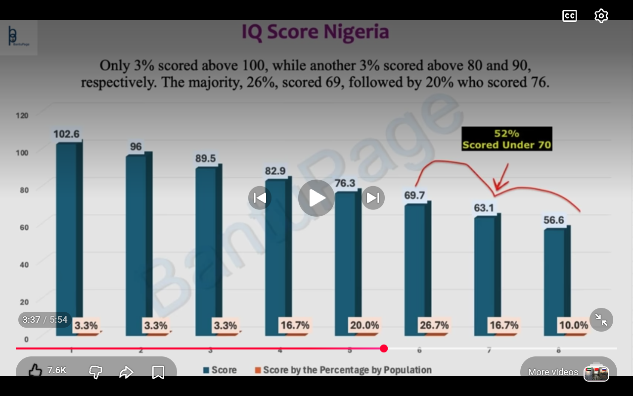
Allegedly Team which I presume is black runs IQ test in Nigeria and presenter claims they came up with similar results to previous test giving studies
Screenshot from video at link

Follow
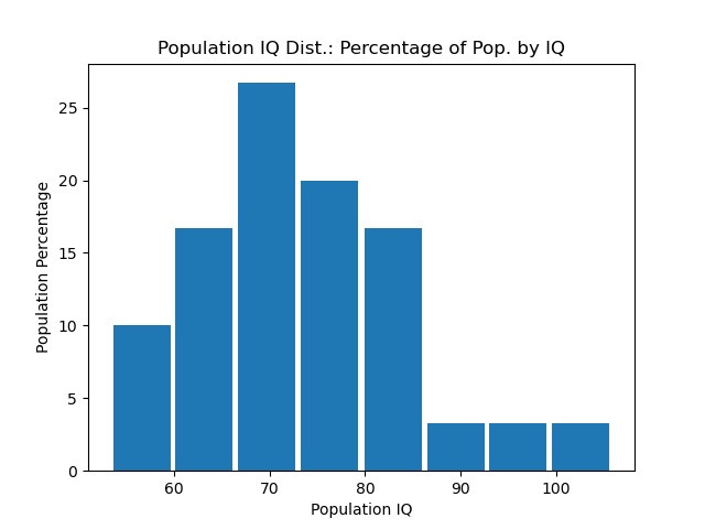
Where did you get the raw data from to plot the graph if it is called a graph in this context
Maybe a histogram?

The point was mainly that the original figure was kind of garbage because it doesn't intuitively show the data in a sane way since they showed the IQ value and population percentage as two different colored bar graphs in the same figure. Normally you want it to look like the figure I generated because then you can actually see the actual distribution (which shows the relationship between the random variable measured, here IQ, and the probability/percentage of different values).