
Follow

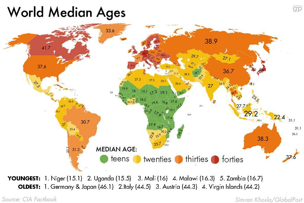
@UncleIroh I suspect two factors are at play for the many of these numbers. A lower number indicates a lower life expectancy, though also a higher birth rate. A higher number is the inverse with a higher life expectancy and a lower birth rate. May not line up perfectly, but I know it tracks for the extremes of the data.