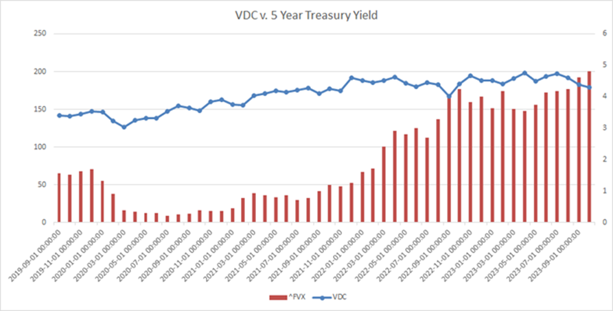
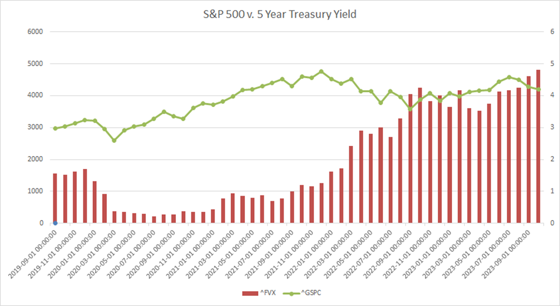
@Tfmonkey I got bored at work and decided to have fun with charts mapping out how overvalued stocks are based solely on yields. The blue line is the s&p500, the green is VDC and the red bars is 5 year treasury yields
@Tfmonkey I screwed up the color, blue is VDC and Green is s&p
@Mike_Microwave @Tfmonkey bhahahha lol
A club for red-pilled exiles.


@Mike_Microwave @Tfmonkey bhahahha lol